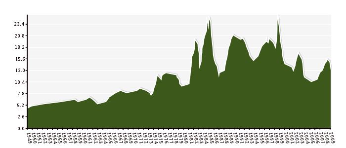
I though it might be interesting to try and graph the Reserve Bank’s prime rate data… It goes back a long way. I used Python to scrape and collate the data and PyCha to generate the graph.
UPDATE: I’ve replaced my graphs with new versions made by Russell who corrected my original code by interpolating the data correctly over the y axis.
This is the narrow version.
And this is the wide version (click to download the actual 10000px wide png)

Interestingly enough, todays rate cut *was* on that page earlier today, but now I see it’s gone… so I inserted it manually 😉
