I know that “Web Usability” is oft touted as being this hard thing… like something akin to the truely black magic that is Search Engine Optimisation, but really, it isn’t… Yes, there are hardcore people studying eyetracking and all kinds of usability studies, but really, all I’m talking about is a little bit of common sense.
Take for instance the people who designed the Morton’s on the Wharf website.
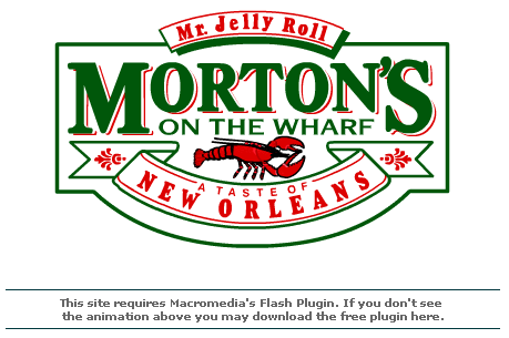
This is their splash page:
Now, firstly, we all know how passée splash pages are. You do know this right… I mean, it’s something we know, like sharing toothbrushes is just not cool.
Yes, in the 90’s, you were super cool if you had a splash page, especially if it was animated. Morton’s has one of these. It says you need flash and directs you to download flash if you don’t.
So what if I don’t have flash? What if I’m on my phone? Firstly, sites designed with flash that don’t NEED flash are just retarded, but we’ll pretend that this site actually needed flash. (Technically it does, but really, it doesn’t)
So I come along wanting to get the phone number to call to make a reservation… But alas, I need flash, and I dont have flash, so instead I get told to download flash… Opera Mini on my phone doesn’t do flash so I’m stuck. All they needed to do was give me their phone number and email address and I would have called. It would have been TRIVIAL to say
“This site needs flash, we suggest you download flash. Alternatively you can call us at 555-2303 or email us at reservations@mortons.co.za”
Am I right or am I right?
Ps. Mortons has good food.
j.

One thought on “Usability really isn't that hard…”